How to design mission patches?
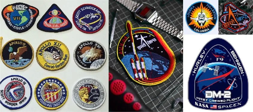
Now, I'm not the foremost authority on mission patches, but hey, I've made several of them for ISRO i.e. The Indian Space Research Organization & I'm a huge treky (nerd speak for star trek fan). & I gotta say mission patch / badge design has its own discipline, rules and graphic style. Ok then, lets get into it! here's some of the badges I've made.
Vintage 60’s patches on the left modern patches on the right. Retro!!!!
'Retro' works!
This is a super interesting observation! The space race started in the 1960's between the US and the Soviet Union and it was a A VERY INTENSE RACE. The mission patches worn by astronauts and cosmonauts back then became iconic! Their 60s-70s graphic style have come to define all future mission patches. Even today, A space X mission patch looks retro. I've actually tried making slick modern patches and sure they look great but they just don't hit the same way. So study vintage mission patches, you never know what you might find and of course, throw in some modern touches to add your own flair to it.
Embroidery: the mission patch secret formula
Defined by the medium i.e. Embroidery
You've probably noticed the thick strokes & borders, the lack of shades and you can count the number of colours used on one hand. That isn't because patch designers hate life and like their strokes thick (grow up!), thats because back in the day and even now, mission patches are/were embroidered either by hand or machine. & embroidery has its limits, its a graphic created by the interlacing of threads. So, colours need to be restricted to a maximum of 5 or 6. and since mission patches are on average around 4 to 5 inches in size, your design elements, logos & fonts need to be large and clear enough for them to be embroidered. So, whats with the thick strokes? They're there to create clean sections between the embroidered bits or things could get messy. Now, your question could be, 'hey, Adip you fool, but i'm not going to embroider my patch, ill be printing these on a tshirt or printing it digitally, I don't need these shackles' Ah, but, this takes me back to point one, the restrictions of embroidery have become part of their graphic style. But let me tell you, a digitally printed patch has nothing on the textured loveliness of an embroidered patch.
All that drama
Lights! Action! scene!
If you look at most mission patches from NASA, Space X or ISRO there is a dynamic scene being set. There's a rocket taking off with smoke plumes or jets of fire, an orbiter circling a planet, a crew module hurtling through the atmosphere and so on. Honestly, this could be the most important part. This is the part that inspires a generation or gets its own close up shot in a movie where Bruce Willis saves the world. So, if you are making a patch about a moon mission but for the depatment that is working on the launch vehicle, then your launch vehicle is your hero object and should dominate the design. And being the hero it should be doing something, well, heroic. It can either take off dramatically or it could even try escaping the confines of the badge, for added prettiness, stripes in the form of a trail always look lovely. The next most important elements are the name of the mission and the name of the agency, how you make them standout is completely upto you! Have fun with it!
so many shapes and sizes!
The Shape
Ever wondered why most patches are round? Because a round shape works anywhere. Especially on chests or arms where patches normally go. But dont let that stop you from exploring different shapes. Hell, a triangle or a spear shape can represent the aggression and speed of a rocket. Just try and stay away from shapes that are horizontally biased or shapes that are too asymetrical, simply because an arm only has so much real estate to offer. If you’re going to be bold and try a weird shape, place the shape on the arm of a mockup to see how it looks. if it works, awesome! good for you!
yeah, that about sums it up! Theyre really fun to make. As Captain Picard would say ‘engage’


